Transit Wayfinding
Reimagining real-time navigation for public transit riders
Role
UX Designer & Researcher
Team
1 designer, 2 engineers, transit authority liaison
Duration
3 months
Tools
TL;DR
Redesigned a transit app's wayfinding experience that reduced missed connections by 26% and increased rider confidence scores from 2.8 to 4.1 out of 5.
The Business Problem
The regional transit authority's existing app had real-time data but presented it in a way that confused more than it helped. Riders were missing connections because transfer information was buried 3 levels deep. The agency was spending $340K annually on call center support for questions the app should have answered, and ridership was declining 4% year-over-year among riders under 35.
- $340K annual call center cost for wayfinding questions
- 4% YoY ridership decline in under-35 demographic
- Transfer information buried 3 navigation levels deep
Constraints & Trade-offs
The transit authority's real-time data API had a 15-second refresh limitation and frequent accuracy gaps. We couldn't change the data infrastructure, only how we presented it. The app had to work offline in subway tunnels where riders lose connectivity, and all text had to work in 4 languages without breaking layouts.
- 15-second minimum API refresh rate with known accuracy gaps
- Offline functionality required for underground stations
- Multi-language support (EN, ES, ZH, KO) with no layout breakage
- 3-month timeline tied to transit authority's fiscal year budget
Process & Approach
I rode the transit system for 2 weeks during peak and off-peak hours, documenting pain points in real time. I conducted guerrilla interviews with 30 riders at 6 major transfer stations. The key insight: riders didn't need more data, they needed confidence -- knowing they were in the right place, heading the right direction, at the right time.
- 2 weeks of contextual observation across the transit network
- 30 guerrilla interviews at 6 high-traffic transfer stations
- Journey mapping of 8 common multi-transfer routes
- A/B tested 2 navigation paradigms with 50 riders via prototype
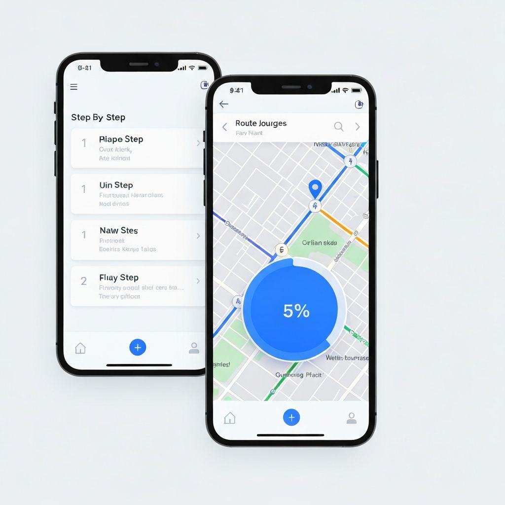
The Solution
A step-by-step wayfinding mode that activates during trips and tells riders exactly what to do next in plain language. Instead of showing a complex map with all routes, the redesign shows one instruction at a time: 'Stay on for 3 more stops,' 'Transfer here -- walk to Platform B,' 'Your stop is next.' Confidence indicators show data freshness so riders can trust what they see.
- Step-by-step guided mode with one clear instruction at a time
- Data confidence indicator showing real-time feed freshness
- Offline-capable with pre-cached route data for underground segments
- Proactive push alerts for disruptions affecting the rider's active trip
Outcomes & Impact
After launch to 18K daily active riders, missed connections dropped 26% in the first month. Rider confidence scores jumped from 2.8 to 4.1 out of 5. Call center volume for wayfinding questions dropped 38%, projecting $129K in annual savings. The transit authority approved Phase 2 funding based on these results.
- Missed connections reduced 26% in first 30 days
- Rider confidence: 2.8 to 4.1 out of 5
- Call center wayfinding volume down 38% (~$129K projected annual savings)
- Phase 2 funding approved by transit authority board