LearnLoop Design System
Building a scalable design system for an edtech platform
Role
Design Systems Lead
Team
2 designers, 2 engineers
Duration
5 months
Tools
TL;DR
Built a design system from scratch that reduced design-to-dev handoff time by 60% and enabled 3 product teams to ship 2x faster with consistent UI across web and mobile.
The Business Problem
LearnLoop had 3 product teams building features independently with no shared component library. The same button existed in 7 different styles across the platform. Design reviews were consumed by inconsistency debates instead of product strategy. Engineering was rebuilding the same UI patterns from scratch on every feature, and the visual inconsistency was eroding user trust.
- 7 different button styles across the platform
- Average 40% of engineering time spent rebuilding existing UI patterns
- Design review meetings averaged 60% time on consistency, 40% on strategy
Constraints & Trade-offs
The system had to serve both web (React) and mobile (React Native) with shared design tokens. I had no dedicated engineering support for the first 2 months and had to build initial adoption through grassroots evangelism rather than a top-down mandate. The existing codebase had significant tech debt that limited how quickly teams could migrate.
- Must support React (web) and React Native (mobile) from shared tokens
- No dedicated engineering resource for first 2 months
- Adoption had to be voluntary -- no executive mandate
- Legacy codebase required incremental migration, not a rewrite
Process & Approach
I audited every screen in the product (340+ unique screens) and cataloged every UI pattern into a frequency-impact matrix. This identified 28 high-value components that covered 80% of the UI surface area. I started with the 5 most-used components, shipped them with comprehensive documentation, and used early adopter success stories to drive organic adoption across teams.
- Full UI audit: 340+ screens cataloged into pattern inventory
- Frequency-impact matrix to prioritize component build order
- Pilot program with 1 team before expanding to all 3
- Built contribution guidelines so teams could extend the system
The Solution
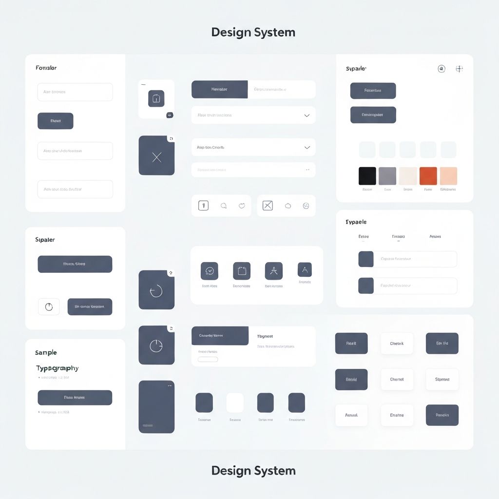
A 120+ component design system with Figma components, React/React Native implementations, and Storybook documentation. Design tokens (color, spacing, typography) are defined in a single source of truth and compiled for each platform. Every component includes usage guidelines, do/don't examples, and accessibility annotations.
- 120+ components with 1:1 Figma-to-code parity
- Platform-agnostic design tokens compiled per target (web/iOS/Android)
- Storybook documentation with interactive examples and a11y checks
- Contribution model allowing teams to propose and build new components
Outcomes & Impact
Within 5 months of launch, all 3 product teams were using the design system with 94% component adoption. Design-to-dev handoff time dropped 60% because engineers could reference Storybook instead of redlining Figma files. Feature shipping velocity doubled as teams stopped rebuilding common patterns.
- 94% component adoption across all 3 product teams
- Design-to-dev handoff time reduced 60%
- Feature shipping velocity doubled (measured by PRs merged/sprint)
- Visual consistency score improved from 42% to 96% in quarterly audit