FinFlow Dashboard
Redesigning a fintech analytics platform for enterprise teams
Role
Lead Product Designer
Team
2 designers, 4 engineers, 1 PM
Duration
4 months
Tools
TL;DR
Redesigned a fintech dashboard that reduced average task completion time by 40% and increased daily active usage by 28% across 200+ enterprise accounts.
The Business Problem
FinFlow's enterprise clients were churning at 18% annually. Exit interviews revealed the same friction: the analytics dashboard required 12+ clicks to complete core workflows, and users couldn't customize views to match their reporting needs. The sales team was losing deals to competitors who offered more intuitive self-serve analytics.
- 18% annual enterprise churn rate (industry avg: 10%)
- Support tickets for 'how do I find X' increased 45% QoQ
- Sales team losing 3 of 10 competitive deals citing UX as blocker
Constraints & Trade-offs
We had to ship within the existing React component library to stay on a 4-month timeline. The backend team had zero capacity for new API endpoints, so every design had to work with the current data model. We also couldn't break backward compatibility for the 40% of users who had built custom report templates.
- No new API endpoints -- designs must work with existing data layer
- Backward compatibility required for custom report templates
- 4-month hard deadline tied to annual enterprise contract renewals
- Accessibility compliance (WCAG 2.1 AA) required for government clients
Process & Approach
I started with a task analysis of the top 5 user workflows using Looker session data and identified that 80% of daily usage fell into 3 core tasks. I ran 8 moderated usability tests on the existing product to baseline task completion times, then designed and tested 3 progressive iterations, validating each with 5 users before moving forward.
- Quantitative: Analyzed 10K sessions in Looker to identify top workflow patterns
- Qualitative: 8 moderated usability tests to baseline current friction points
- 3 iterative design rounds with Maze unmoderated tests between each
- Weekly design reviews with engineering to validate technical feasibility
The Solution
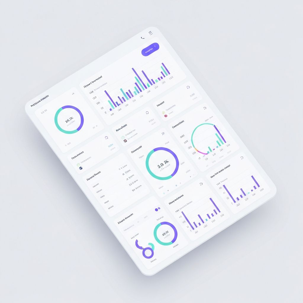
A redesigned information architecture that reduced core workflows from 12+ clicks to 3-4. I introduced a customizable widget system that let users drag-and-drop analytics modules into personalized dashboards, while preserving all existing report templates through a migration layer. The new command palette (Cmd+K) gave power users instant access to any report or action.
- Customizable widget-based dashboard with drag-and-drop layout
- Command palette for instant access to reports and actions
- Progressive disclosure: simple defaults with depth on demand
- Automated migration for existing custom report templates
Outcomes & Impact
After a phased rollout to 200+ enterprise accounts, the redesign delivered measurable improvements across every target metric. Most importantly, the churn rate for enterprise accounts dropped from 18% to 11% in the first two quarters, directly retaining $1.2M in ARR that was at risk.
- Task completion time reduced by 40% (from 4.2 min to 2.5 min avg)
- DAU increased 28% within 60 days of launch
- Enterprise churn dropped from 18% to 11% (7pp improvement)
- NPS increased from 32 to 51 among enterprise segment